【ブログ改修計画 その1】ヘッダー
- CREATE:2022-07-17
- UPDATE:2022-07-17
概要
ブログを独自UIに改修するために、色々書いていこうと思います。
練習のためにHTMLファイルとCDNのVueにて行います。
今回はヘッダーです。
使用する言語
HTML5
CSS3
Vue.js(Nuxt.jsにて動かすため)
ソースコード
index.html
<!DOCTYPE html>
<html lang="en">
  <head>
    <meta charset="UTF-8" />
    <meta http-equiv="X-UA-Compatible" content="IE=edge" />
    <meta name="viewport" content="width=device-width, initial-scale=1.0" />
    <link rel="stylesheet" href="css/style.css" />
    <title>Document</title>
  </head>
  <body>
    <div id="app">
      <div id="header">
        <div class="size">
          <div class="left"><a class="title" href="/">Pincer's Blog</a></div>
          <div class="right">
            <ul>
              <li><a href="/privacy">プライバシーポリシー</a></li>
              <li><a href="/contact">お問い合わせ</a></li>
            </ul>
          </div>
          <div class="clear"></div>
        </div>
      </div>

      <h1>ブログ</h1>
    </div>
    <!-- 開発バージョン、便利なコンソールの警告が含まれています -->
    <script src="https://cdn.jsdelivr.net/npm/vue@2/dist/vue.js"></script>
    <script src="js/javascript.js"></script>
  </body>
</html>
style.css
html
{
height: 100%;
}
body
{
height: 100%;
margin: 0;
}
#app
{
height: 100%;
}
#header
{
width:100%;
}
.size
{
width: 98%;
max-width: 1100px;
margin:0 auto;
}
.title
{
font-size: 32px;
padding:10px 0 0 10px;
text-decoration: none;
color:black;
transition: 0.3s;
}
.title:hover
{
color:blue;
}
#header .right ul
{
list-style: none;
padding:0;
}
#header .right ul li a
{
text-decoration: none;
}
@media screen and (min-width: 769px) {
#header .left
{
float: left;
width:25%;
}
#header .right
{
float: right;
width: 75%;
}
#header .right ul
{
}
#header .right ul li
{
float: right;
width: 25%;
text-align: center;
}
#header .right ul li a
{
text-decoration: none;
}
.clear
{
clear: both;
}
}
@media screen and (max-width: 768px) {
#header .right ul
{
margin:0;
}
#header .right ul li
{
float: right;
width: 49.5%;
text-align: center;
background-color: brown;
}
#header .right ul li a
{
display: block;
color:white;
}
#header .right ul li+li
{
border-right: 1px solid white;
}
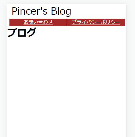
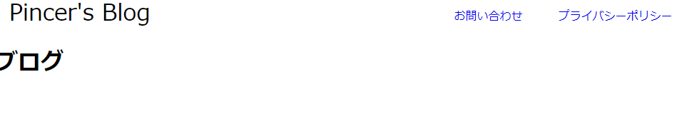
}結果
・PC
・スマートフォン